LanguageCards 2
Author: Samuel Peterson
Date Published
2018-07-29 (ISO 8601)
73-07-29 (Post Bomb)
This post is the second in the series about the development of the Language study tool called LanguageCards. The first post described the relational algebra underlying the LanguageCards system, along with some notes regarding intended usage. The next step in the development of this tool designing the first elements of a user-friendly interface. Specifically, this post handles the first iteration of the essential components to a user interface. For starters, I'll list what I consider essential features for the program.
What we want from our interface
The purpose of the interface is to make the following actions on the LanguageCards database both efficient and self-explanatory:
- View a card
- Edit a card
- View translations or examples on a card
- Add or remove translations or examples on a card
- View a Deck
- Create a new Card
- Add or remove cards in a deck
At the time of this writing, the interface for LanguageCards does provide the listed functionality. What it misses the mark on at this time is the ease of use. Before we get into that, let's cover some basic decisions made about the components used.
What we will build our interface with
There are a lot of different toolkits and programs out there for developing Graphical User Interfaces (GUIs), so I had to determine what I would use. This involves some matters of personal taste, so I will say a little about what is and what is not important to me.
- First: old and clunky-looking is fine. I'm looking for pure functionality, not sex appeal.
- Second: I'd like the interface to work on multiple platforms with a minimum of tuning.
It so happens that Python does have a toolkit of sorts, or rather it has another toolkit built in: Tk, which is a separate and well-matured project. After looking at this option for a while, I determined it would be completely satisfactory.
What does it look like?
Still a bit primitive. What is becoming clear is that simplicity of implementation is not the same as simplicity of use. This iteration of the gui involved a separate window for almost every type of interaction -- easy to program, but rather clunky. For example, currently there are separate views to look at a deck, look at a card (in detail), edit a card's example/translation fields, and to create a card. For instance, if I wanted to create a new card with some examples and translations, I would need to create the card (without any translations or examples), create separate cards for those translations and examples, then select the original card, and add the newly created examples and translations to the card. Ideally, all of this would be accomplished in one view.
Below are some screenshots of the implemented features.
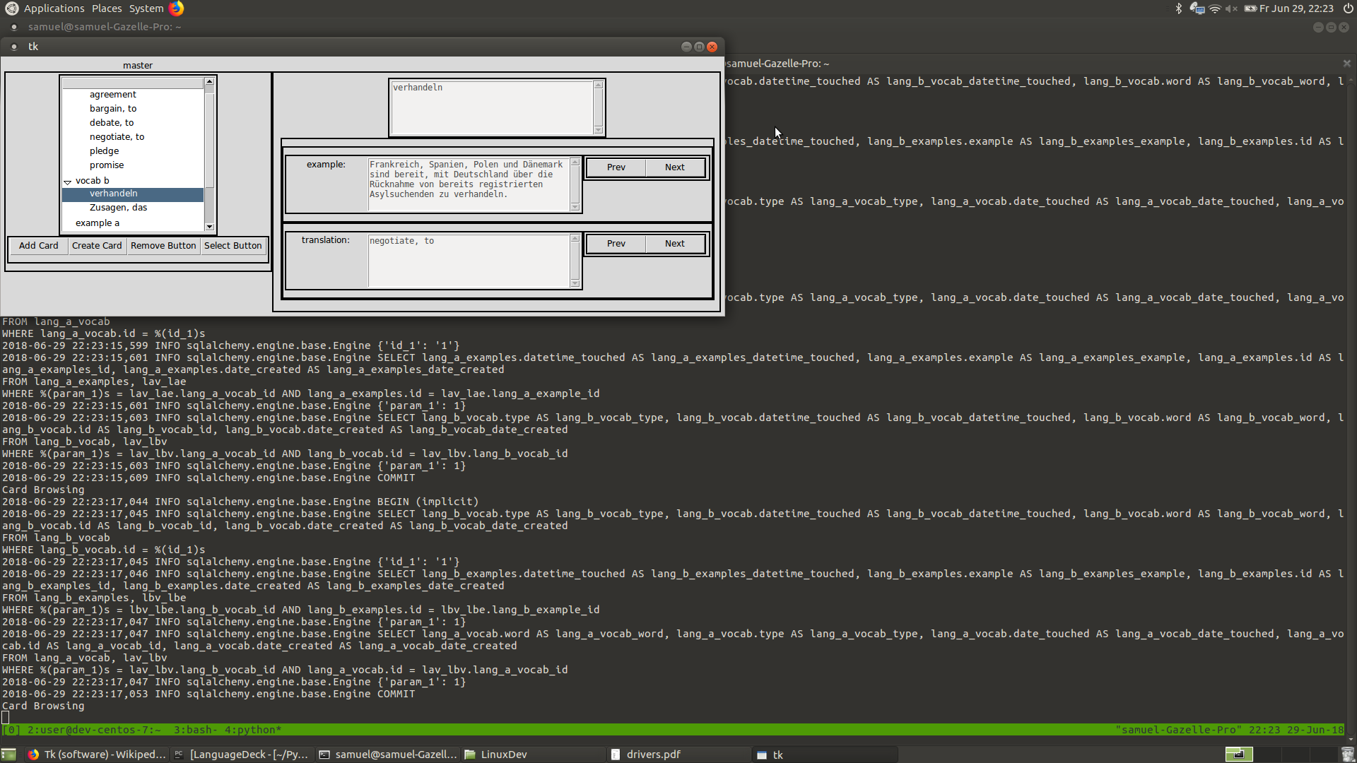
Browse view: Look over cards in the active deck.

Selection View: Detailed view of cards.
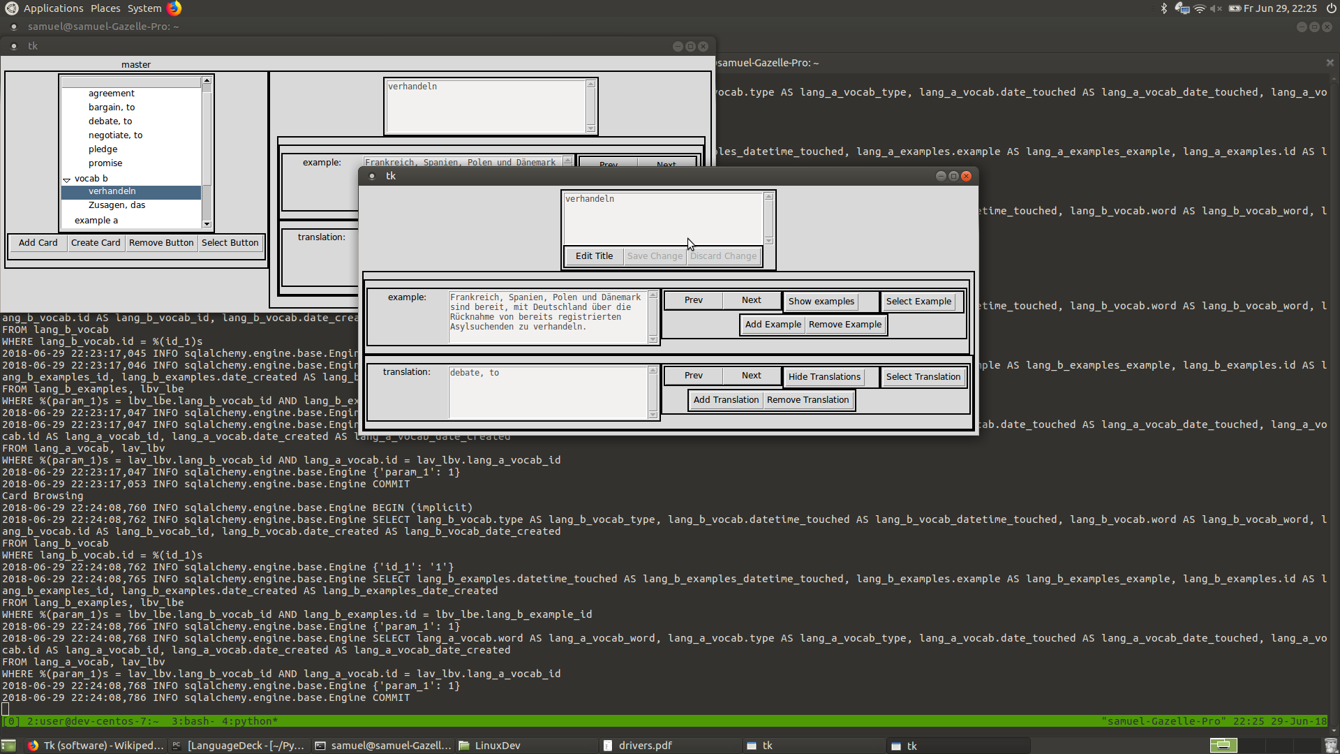
Selection View: exmaples and translations shown.
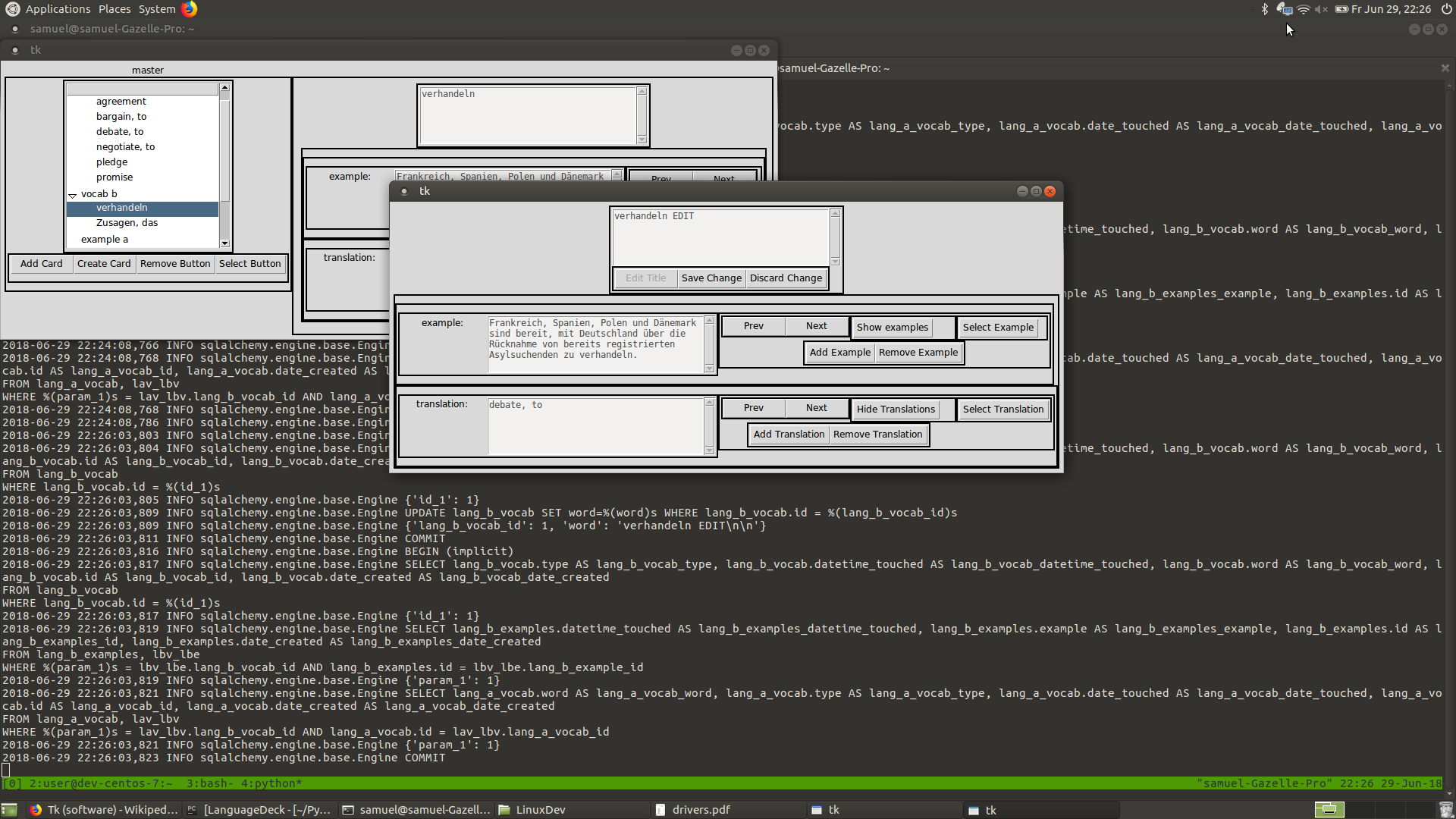
Selection View: Editing the Card's primary field.
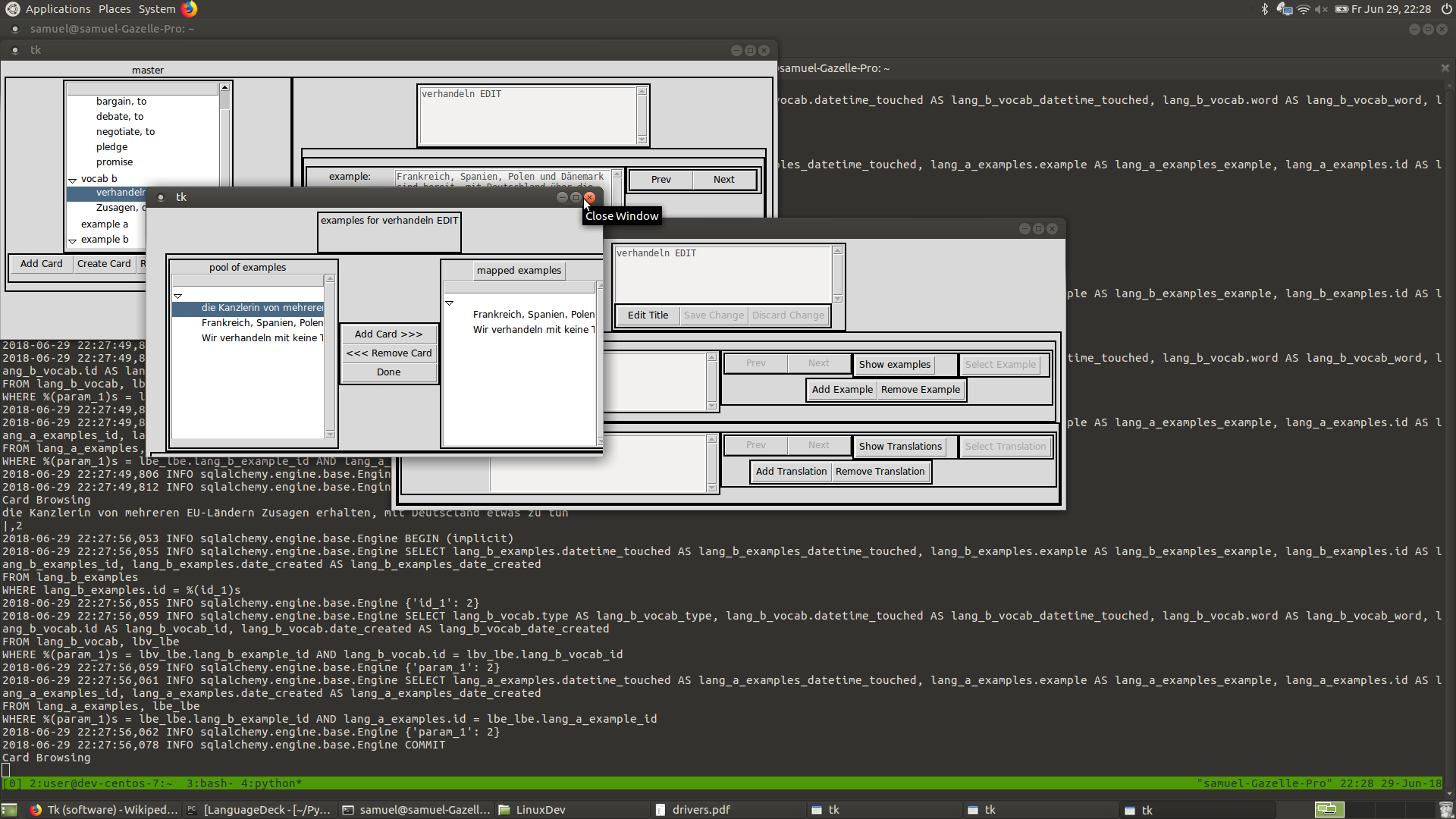
Edit Examples View: Adding and removing example cards.
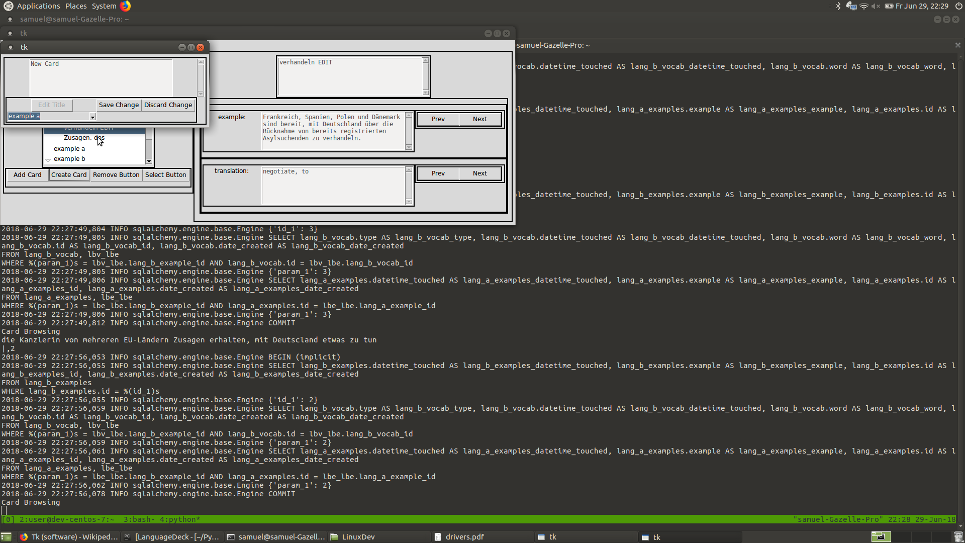
New Card: Look over cards in the active deck.
What's next?
Simplifying the current available functionality is now the first priority. I want to be able handle the creation of new cards, along with the editing of their example and translation fields in a way that does not seem oppressively clumsy; Only after simplifying will I expand the interface to include multiple deck manipulation, and quizzes.
Again, you can look at the current state of the source code on github .